for the font that i use to write the "press start" etc on the titlescreen i usually use a 7x7 lettering but it really depends.
the font i made for Dimensionshift for example, is 7x7 with a 1px dropshadow on it so it still looks a little "spaced" but in reality the tiles are all 8x8. it works pretty well but depends on your palettes really, the dropshadow
needs to be fairly dark or the font will just come out too busy looking and hard to read.
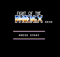
for the larger texts like the actual logo of the game. In my case, that is a font too. i picked a nice looking font, and set the size so that it will fit nicely in a set row of tiles VERTICALLY. then just adjust from that.
there are more space efficient ways to do this, such as using a blocky font or so to get lots of reused tiles and that way reduce the overall tile count, but for a text logo, you should generally have enough space to get a fairly large text logo in with ease.
in my game's logo, some manual cleanup and alignment was done to the text to weed out few "useless" tiles but not really a big deal.
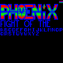
here's how my title screen CHR actually looks like.